I recently built a small design system for personal use using Claude Code and the Figma Console MCP. Read on to find out how I did it and what I learned in the process.
Why I decided to build my own design system
I wanted a basic design system for personal projects
I’ve been doing a lot of side projects and experiments lately - some vibe coding, some playing with design to code workflows, and some just good old fashioned coding - and a lot of these projects could stand to have a design system to work with. Since I’m just working on side projects I didn’t have an existing design system to work with and I though rather than using an open source system I’d try my hand at building my own, because…
I wanted more hands-on practice with design systems
I haven’t really had much chance to work on design systems in my day jobs, but when I have I’ve really enjoyed it. I’m a very systematic thinker and things like setting up tokens, building the semantic layer, and thinking about all the potential places where something could be used or misused just really clicks in my brain. It’s definitely an area I’d like to explore more.
I wanted to learn more about how AI uses design systems
Design systems are becoming even more critical as we move into more agentic ways of working. I wanted to learn more about how AI consumes design systems, how different coding tools use MCP servers, and what the tradeoffs are between various design-to-code workflows.
So I decided to build a basic white label design system. I intentionally kept it pretty basic and generic so that I can use it for a wide variety of projects and create new themes and new components based on the original design system as needed.
Building the system
Creating my primitives
My first step was setting up the primitive tokens. Since my main focus was the actual system part rather than a specific visual or brand design I pulled most of my primitives (colors, spacing, fonts, etc) from open props.
Having Claude create semantic and component tokens
I added them to a JSON file and then prompted Claude Code to create semantic and token components. I provided it with naming conventions, told it to check WCAG AA contrast levels, and had it output the results to a new json file.
Use the primitive tokens found in the primitives.json file.

Create semantic and component tokens:
- Semantic tokens for surfaces, text, borders, interactive states
- Component tokens for button, input, card (primary, secondary, danger variants)
- Ensure WCAG AA contrast
- Output as tokens.json

Naming convention:
- Semantic: color-[name] (color-primary, color-surface)
- Component: [component]-[variant]-[property] (button-primary-bg, button-primary-text)
Once the tokens file was complete and I’d reviewed it I prompted Claude to:
- create a separate dark mode theme
- generate CSS files for both my base theme and my dark mode them
- run the build with
node build.js
JSON to Figma import
After that was in place I wanted to set up my variables in Figma. I spent quite awhile looking for plugins that would automatically setup my variables from a JSON file. They all required a specific JSON format and most of the ones I tried didn’t specify the format and just gave a generic error message when it was wrong.
I ended up having Claude convert my existing tokens.json to a new json file using the Design Tokens Community Group format and used the Variables Import plugin, which did an okay job. It handled the colors really well, but I ended up doing a fair bit of manual cleanup for sizes and the variable organization.
Creating the components
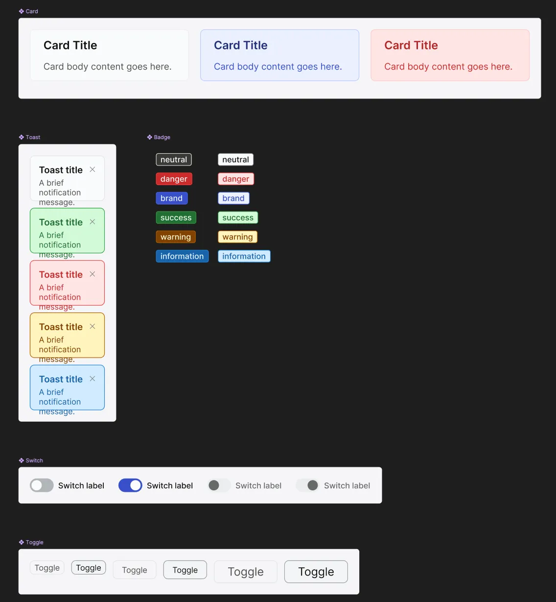
My next step was to have Claude create my components. I had it create React components using Radix UI components, CSS modules, and my design tokens and also had it set up Storybook stories for each component.
Here’s the prompt I used to create the component library:
I have a Radix UI component library using CSS modules and design tokens.


My tokens are published on GitHub at https://github.com/made-by-max/DS-tokens/tree/main.

I have dist/base.css and dist/dark.css available.


Build these components in JSX


1. Button - all variants and sizes from tokens (primary, secondary, danger, etc. × sm, md, lg) - wraps Radix button

2. Card - header, body, footer sections

3. Tag - simple topic tags

4. Badge - all solid and outline variants pre-built, no semantic color mapping

5. Checkbox - wraps Radix Checkbox

6. Input - text input wraps Radix Input

7. SearchBox - input with search icon

8. Select - wraps Radix Select

9. Dialog - modal dialog wraps Radix Dialog


Requirements:

- Use CSS modules for styling

- Import CSS variables from my published tokens (dist/base.css)

- Use my design tokens for colors, spacing, typography.

- Accept props for variants (button-variant, button-size, badge-variant, etc.)

- Each component gets a .module.css file with all variants pre-built

- For Button: build every button variant and size combination from my tokens

- For Badge: build every color from my tokens × solid/outline (e.g., badge-blue-solid, badge-red-outline, etc.)

- Include Storybook stories for each component

- Set up .storybook/main.js and preview.js

- Export all components from src/index.js

- Create globals.css that imports from my tokens dist/base.css


For each component, include: - The component file (JSX) - The CSS module file with all variant combinations - A Storybook story file showing each variant


Component details:

Badge: solid and outline variants, different bg colors

Checkbox: basic checkbox with label support

SearchBox: input with search icon on left, placeholder "Search..."

Dialog: modal with close button, overlay, title, content


Set up Storybook so I can run 'npm run storybook' and see all components immediately.
Making updates
For the most part Claude did a pretty decent job of creating components according to my instructions. I ended up doing some manual refactoring, but mostly because I changed my mind about how I wanted some things architected, not because of any issues with Claude.
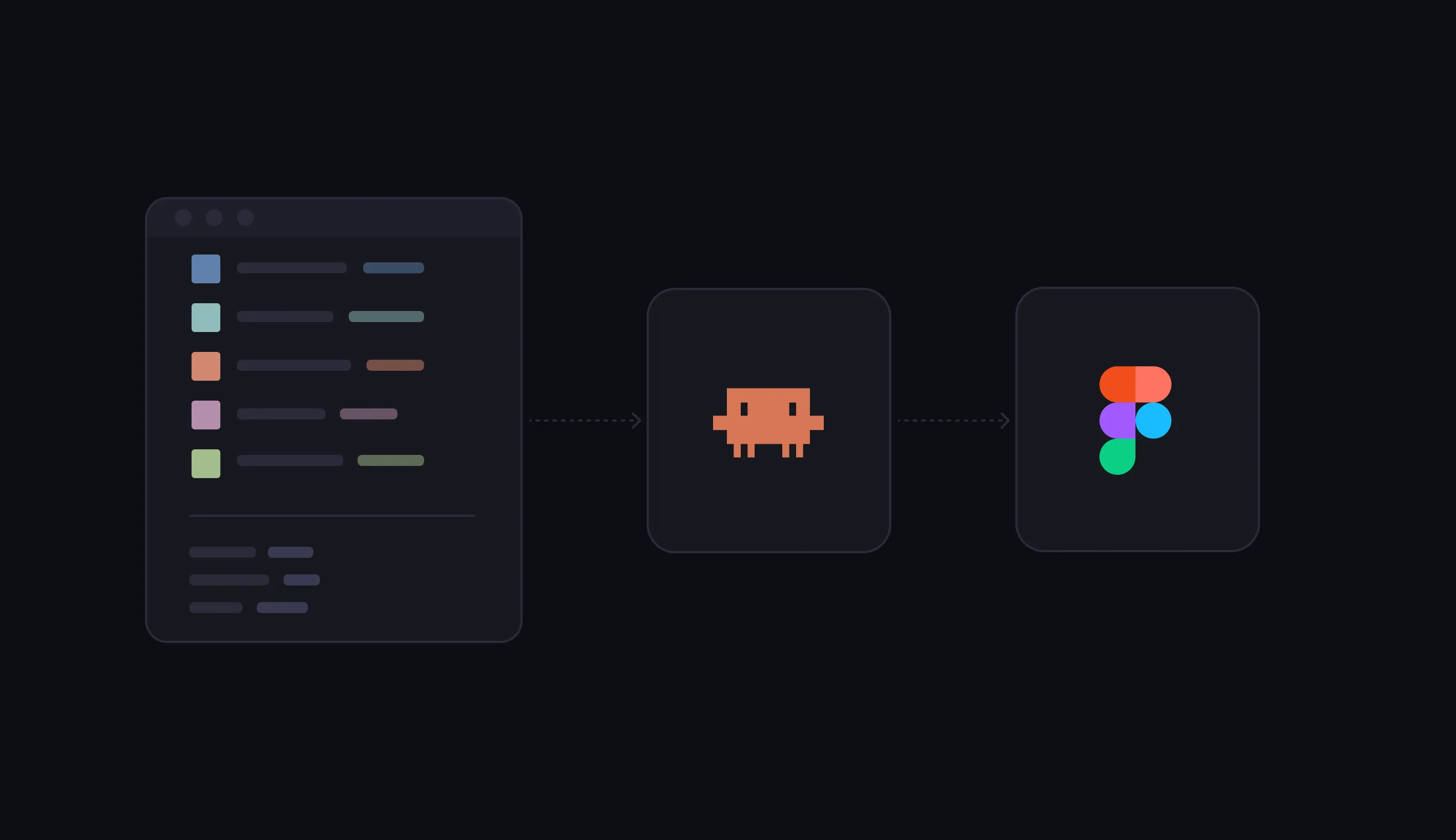
Code to Design
Once I was happy with my components and CSS, it was time to get everything working in Figma. After my struggles with the JSON import I was worried about what an undertaking this was going to be. Thankfully I stumbled across this article and learned about the Figma Console MCP, which is much more capable than the default Figma MCP and could create my variables and components in Figma from my code.
I decided to use my badge components as an initial test case and had it create a badge component with all the different variants and set up the variables for the tokens. I was extremely pleased with how well it handled that task, so for the next step I had it set up all my primitive variables and then my semantic variables aliased to the primitives.
Once I confirmed that it had successfully set up my variables I prompted it to create the remaining components and alias the component variables to the semantic variables. It did a great job of setting up the variables, but it didn’t actually create any components, so I had to prompt it again to finish the job 😅 (side note - this is the one time in the process when I hit my token limit with the Pro plan)
On the whole it did a surprisingly good job creating my components. The autolayout on my toast components was a little wonky and I had to do an additional prompt to get it to create all the different states for my button components, but those were the only real issues it had. It was definitely a lot less painful than trying to import from JSON.
Using it
Once everything was created it was time to put it to the test! I set up npm packages for my tokens and components for Claude Code to use and tested it out with a couple of different workflows.
First, I created a design in Figma using my design system as a library and used the Figma MCP to have Claude Code create the page using the variables in Figma.
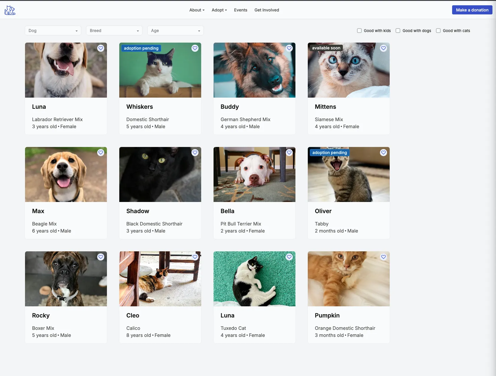 Then as a separate workflow I prompted Claude Code with a description of the page and had it create the page solely using my components (no Figma at all).
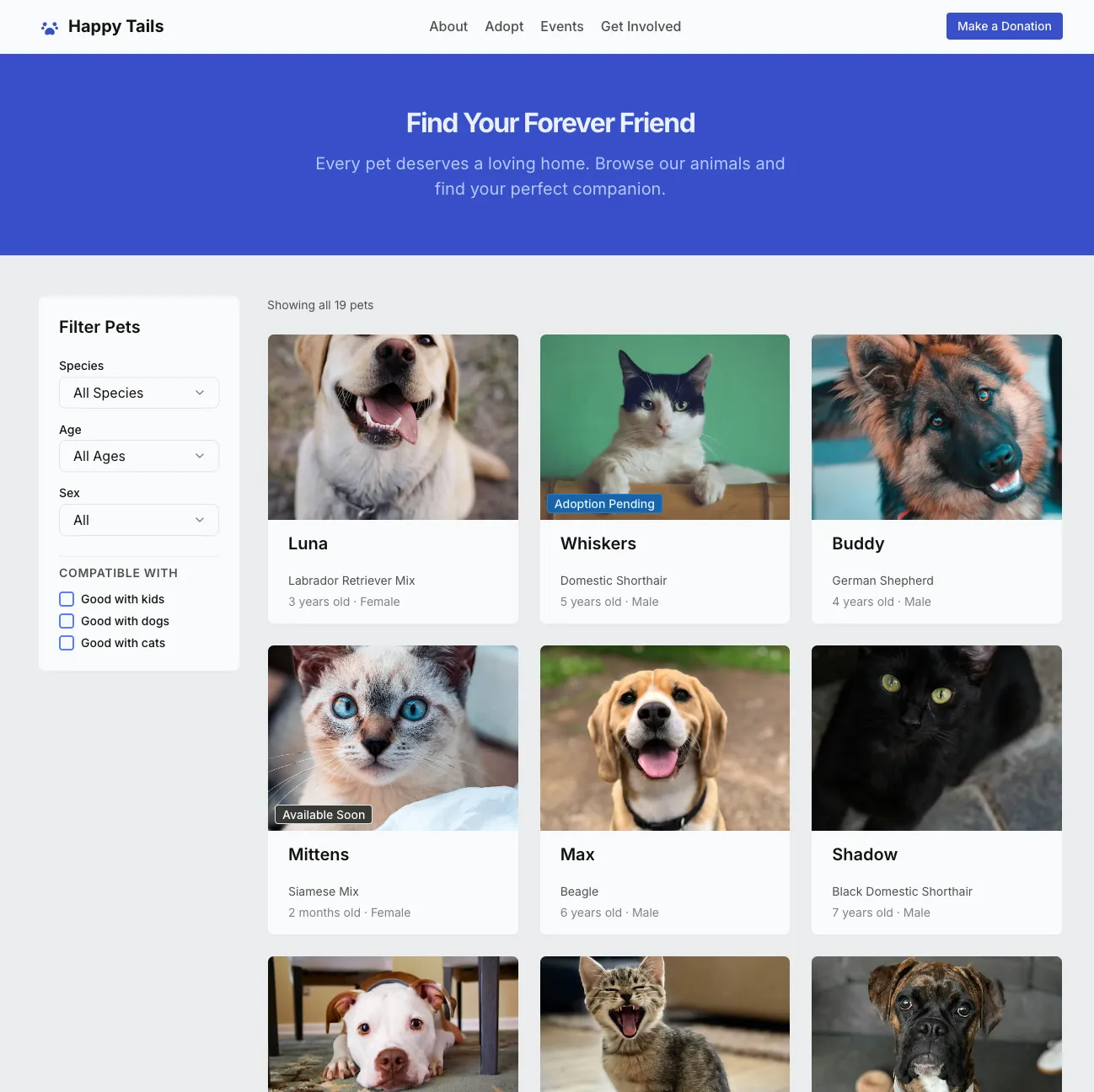 And finally I gave it the same prompt but also gave it access to the Figma design.
I plan to write a more in-depth post about these different workflows (I’ll update here once that’s live), but all three produced a passable rendering of my design, though only the ones using the React components had functional filters.
Design decisions
Why I went with Radix
I decided to use pre-built components because my goal with this project was setting up the system and I didn’t want to get bogged down with creating individual components. I went with Radix because it’s pretty standard and has accessibility built in. I chose Radix over Shadcn because I wanted to have full control over the CSS and not be locked in to using Tailwind.
CSS Modules
There’s a lot of options for writing CSS in React and everyone seems to have their own opinion about which is best. I opted for CSS modules mostly because it’s what makes the most sense to me. It let’s me write pure CSS (as opposed to Styled Components) and each component has its own scoped CSS.
JSX vs TSX
I opted to create the components in JavaScript vs TypeScript because I wanted the flexibility to create my side projects in either JSX or TSX. I’m still getting comfortable with TypeScript and while I’m trying to incorporate it into more of my projects I still want the option to not use it.
Token Architecture
As I alluded to previously, I made some changes to the way my tokens were set up partway through the project. Mostly this was due to my own inexperience with design systems. I did a fair amount of research on naming conventions and best practices, but as things started taking shape I realized I just didn’t like the way my semantic color tokens were set up and decided to refactor those.
I also decided to remove the component tokens from the tokens file and just reference the semantic tokens from my CSS modules. If I were designing a larger production design system having both might make more sense, but for a small personal system it felt like an additional layer of abstraction that wasn’t necessary. We’ll see if I regret that as I start creating new themes 😅
Why I started with code instead of design
For one thing, pasting a list of tokens into a json file is a heck of a lot easier than manually adding variables in Figma (why is that still so hard???). I’ve also been leaning into coding a lot more lately and I’m planning to use the design system more for coding (and vibe coding) side projects than for design work, so it just made more sense to me to start with the code. And since everything was built off of Radix components, getting started with code just seemed like the logical choice.
What’s next?
Now that I have a basic system in place I plan to keep refining and expanding it as I work on more side projects. Even with just the simple landing page I designed I was already feeling limited.
Tools and workflows
I also want to try it out with other design tools like Penpot, Paper, and Claude Design and see how it works with different MCPs. And I plan to continue to experiment with different workflows (design to code, code to design, pure code prompts, etc) to get a better understanding of the tradeoffs and which works best in different situations.
Learnings
I learned a lot working on this project!
I have a much deeper understanding of design systems
I already had a pretty decent understanding of tokens from using CSS custom properties and Figma variables, and the idea of setting up different levels of tokens has always clicked really well in my brain. But setting up semantic and component level tokens for an entire system was a new challenge for me, and one I really enjoyed. I have a very strong background in information architecture and this type of systems thinking feels very similar to me. It’s definitely a space I want to work in more.
I have a new appreciation of the challenges of keeping a design system in sync
To me, it makes more sense for the code to be the source of truth and I’m happy that I created my components in code and moved them to Figma rather than vice versa. But at the same time, as I start thinking about adding new components I’m already second guessing myself about whether to create them in design or code and it seems like it’s going to be a hassle keeping the two in sync.
It made me question the role of Figma
I long ago came to the conclusion that prototyping in Figma isn’t worth the headache. And a lot of their recent business decisions have me looking at other tools for personal use. But the difficulty of maintaining parity between design and code seems like a major weakness in an age where more designers are jumping into coding tools to create their prototypes. People talk about tools like Claude Design and Google Stitch being Figma killers, but I think that’s short-sighted. I think there will always be a place for a design tool for exploration and early iteration, whether it’s Figma or something else. And less-technical designers may choose cling to their vector tools for as long as they can. But for high fidelity designs and prototypes, I think the future is going to be in a tool where designers can use coded components in some sort of visual playground.